

About the project
Rottnest Fast Ferries is a local ferry provider based in Perth, WA, offering ferry transfers to and from Rottnest Island. In addition to their core service in ferry transfers, they also offer a range of equipment hire and tour activities in Rottnest Island.
Rottnest Fast Ferries approached Flametree Creative and tasked us to re-designed their websites, as well as their booking engine.
Their website feature a booking system for their ferries, tour, packages, and other activities. This allows customers to pre-book their ticket, select times & fares, adding add-ons, and many more. Having these facilities would grant controls to their customers in pre-booking their holiday.
Background
The client had a fully functioning website and booking system which had been operating. Tasked with redesigning it, Rottnest Fast Ferries gave us space to identify the pain points and pitch solutions.
Once we sat down with the client, we learned about the limitation from both the business and the customer’s perspectives. In order to explore the problems, we also run user testings. As interaction designers, my goal was to improve the usability of the current system.
Empathising with the users
Qualitative Interview with users were taken to understand the problems with the current system. The information was carefully filtered & analysed to create list of pain points and persona.


Problem & Hypothesis
The current booking system lacks visible system status and feedback, leaving people in doubt and frustration. Users suffer from usability issues and made errors during their booking. The goal to automate the sales is not achieved, users often called customer service to help them complete the booking.
Current systems do not provide ways for customer to made changes to the booking, resulting
We believe that by re-structuring the booking process and providing feedbacks, users will feel more in control of the system. Hence, they are able to complete the tasks confidently without the need of calling the help-center.
ANALYSING THE PROBLEM
navigation menu lacks OF hierarchy and contrast
The users attention was broken into three big chunks - the green menu, the blue menu and the widget menu, which were competing for user’s attention. Consequently, they needed more time to find information. Moreover, some menu items appeared in multiple places, raising doubt in deciding which one to choose. Also, based on the user feedback, the submenu was hard to be read.
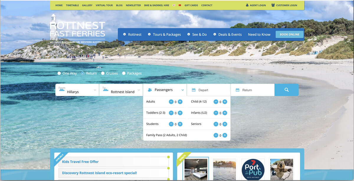
data input needs redesigning to improve usability
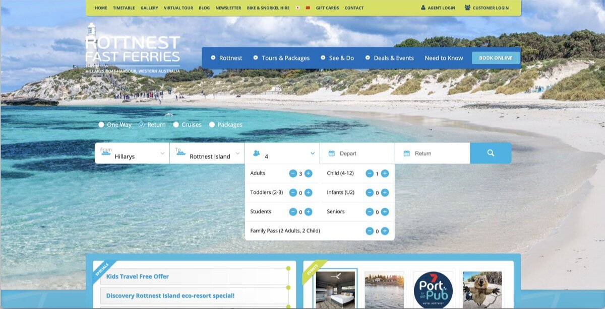
The booking widget had usability issues. The process of inputting data to start the search is quite evolved and required a lot of efforts. While inputting the number of guests, a user had to click 5 times to add 5 adults. In another test, a user had to input a variation of guests, including 2 adults and 2 kids. Once she click off the the widget, she had to re-check her selection due to the minimalist feedback shown in the guests lists. The system failed to provide informative feedback on the guest lists, which encouraged users to re-do the task or to recall what they have selected. This behaviour was prone to human-errors.
ISSUES with the USER INTERFACE
Information is displayed in a limited viewport, forcing users to constantly scroll up and down within the minimal area.
LIMITED system status reports & FEEDBACK
Users lost track of where they were as the system failed to give adequate feedback on the completed tasks. Although the processes to book a ticket (Time, Extras, Passengers, Itinerary and payment) were outlined, there were still sub-processes that were not indicated if completed, such as departure times and luggages. Consequently, users get lost while completing the multi-layered tasks.
Inconsistency & negative transfers
During the user test, most users got confused whether the the platform was asking them to bring an equipment or hire an equipment. This is due to the inconsistent wordings (see screenshot above). Some sentences were displayed with the words “bring your own”, whereas some others not. As a result, when they were selecting the surfboards, they thought that they were renting a surfboard. Furthermore, the highlighted navigation “Extras” made them believe that they were renting it, instead of bringing it.
Redesigning INFORMATION ARCHITECTURE
PREVIOUS SITEMAP
There were too many duplicated pages appearing in both navigation menus.
Some menu items do not belong in the right categories, making them hard to be found.
Some navigation titles do not relate to the content expected by the client. The term “BIKE & SNORKEL HIRE’ under Tour & Packages creates confusion as people started to think that they can hire both of them, while they actually can’t.
The top menu is repeating some items that were already in the main menu.
Improved Sitemap
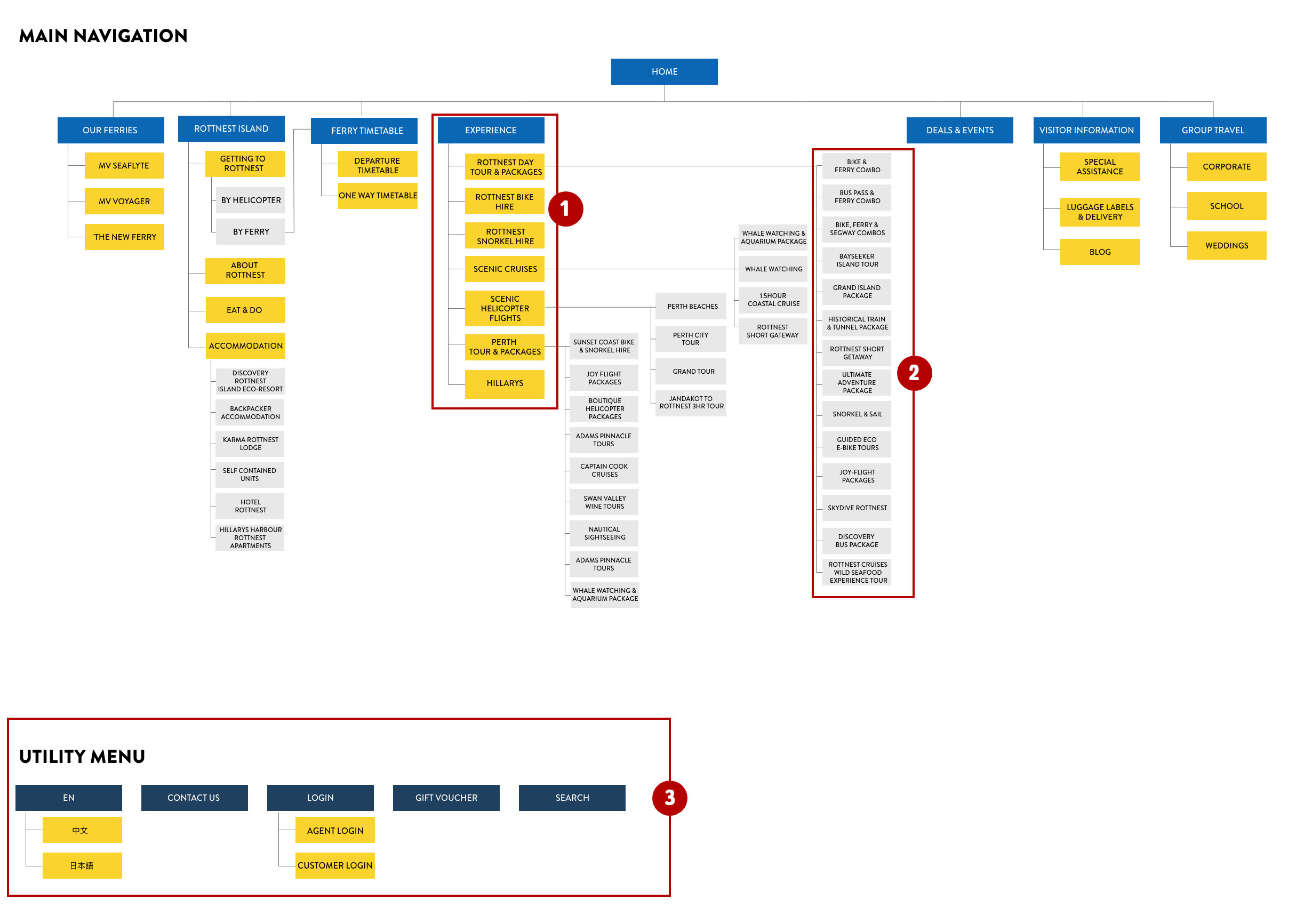
1) EXPERIENCE is a better term to represents the equipment hire as well as the tour & packages. This was discovered when we conducted an Open Card Sorting activity.
We moved ‘Hillarys’ that was originally in ‘See & Do’ into this menu tab. It contains article regarding the activities that visitor can experience while they are in Hillarys, such as visiting Ben & Jerry’s ice cream place, renting bike,
We also moved the gift card and accommodation out of this menu as it did not suit into this category.
2) We eliminated the tour & packages that are not happening in Rottnest Island to be out of the ROTTNEST DAY TOUR & PACKAGES. Items, such as Sunset Coast Bike & Snorkel Hire and Whale Watching has been moved to a different category where it belongs.
3) THE TOP MENU becomes a utility menu, that accommodates language translation, and quick links to contact, login and buy a gift vouchers. We’ve grouped the items into one category for easy find.
Language translation tools can be grouped into Mandarin and Japanese. It is best to use the actual languages (EN, 中文, 日本語) to represents the language for translation. Using a flag represent a country, but not necessarily a language.
Redesigning data input to improve usability
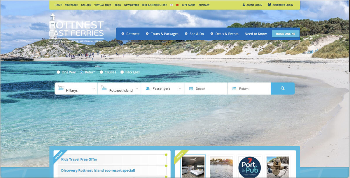
How to improve the data input?
By reducing the number of clicks required to start the search so that the booking system could become more efficient.
By showing informative feedback, specifically with the passengers. When the passenger’s dropdown is not active, the passenger’s input field summarises the total number of passengers. Users cannot validate whether they had made the right selection.
Wireframing


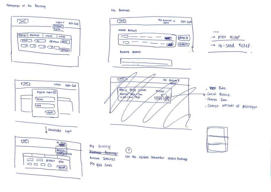
Approach & Solution

Improved version of the data input
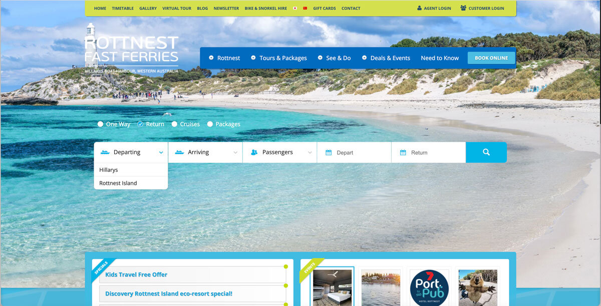
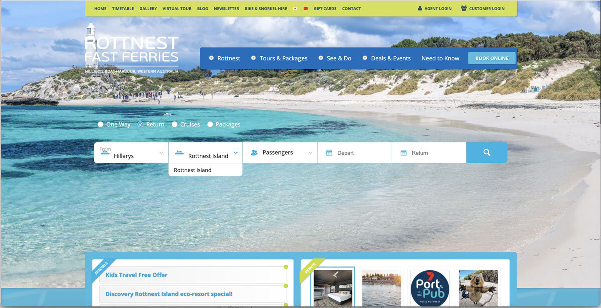
Unlike an airplane booking system or train booking system, Rottnest Fast Ferry booking is very specific. It only goes from Hillarys to Rottnest and Rottnest to Hillarys.
Understanding this, I decided to modify the ‘From’ field from a dropdown to a button group, which would be more efficient for the users as they do not have to click on and off to see the options. Then, by using a disabled field on the ‘To’ field, users are prevented from clicking on and off the dropdown, just to check if there are any options available.
In terms of the passenger selections, I decided to expand it so that each passenger category has its own field with an up and down arrow. This type of field allows users to easily type the number, rather than clicking the plus icons for 5 times to just input 5 adult passengers. Moreover, by expanding it, users will be able to see what they have inputted so they can check them easily and have more confidence that they have made the right selection.