

Background
Baileys Fertiliser is a leading fertiliser manufacturer based in Kwinana, Western Australia. They produce high-quality soil improver, potting mix, mulches, and many more. I was tasked to re-assess the overall layout and improve functionality on some of the pages as they are promoting their content on social media. We first started the project by collecting data to define the pain points within their current site, make priority on what needs improving and proposed a better design.
The Gardening Calendar

The previous Gardening Calendar
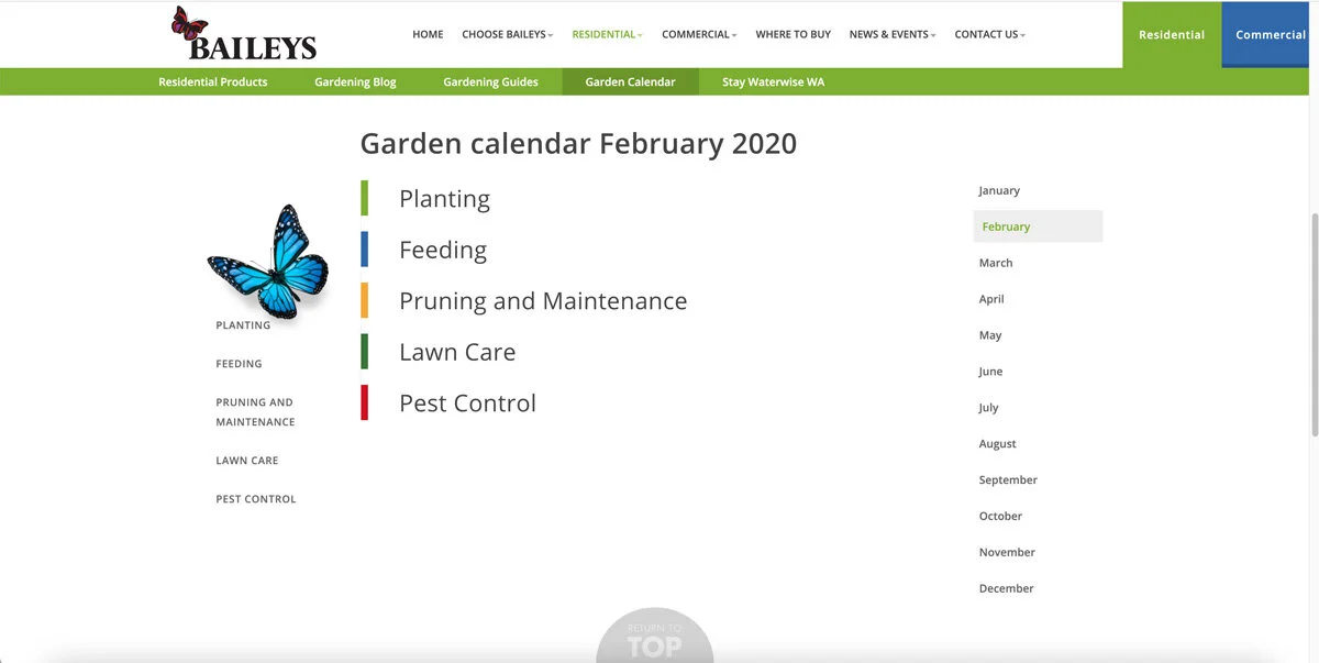
The previous Gardening Calendar
Analysing how their previous gardening calendar works
Their Gardening Calendar is categorised by months and by topics, such as gardening, feeding, pruning and maintenance, as well as lawn. It is also specified based on the month. Therefore, users may select different month and see the content based on the topic that relates to them.
After looking into the analytics, it is apparent that users only stick on the website for a maximum of 3 minutes. While we are researching into how specific users interact with it, it become more noticeable that users have trouble navigating and reading the content. The fact that the content is put inside accordion makes users have to scroll to the next one. When the accordion is opened, users have to take tremendous space to scroll to the next one, which is just too much effort for someone wanting to go to the next section.
Still around navigation, most users indicate that they want an assurance that they are looking at the right month when they first land on the website. Especially when they are opening this from a newletter. Locating the month on the right hand side makes the element become the last thing to read. From order of importance, this should be the first thing user want to see.
From client’s perspective, Baileys would want to advertise their related products more. Currently, the content is highlighted in green and is link to a product page where necessary. However, they wanted to have a related products section to promote their products more.
In addition to that, client has been mentioning competitor’s website (Yates), which has nice pictures and is more interesting to look at.

Gardening Calendar on competitor’s website

Gardening Calendar on competitor’s website
Gardening Calendar on competitor’s website
The Gardening Calendars are grouped by month, after all, that what makes it a calendar.
They both have great visuals with a lot of attractive images.
Alongside with monthly category, Yates Gardening Calendar added another level of sorting.
They sorted the calendar based on the plants, it is a great approach if there is a large chunk of content within each of the topic.
Improved version of the Gardening Calendar
We move the month section to the very left as it is the first element that user needs to select or see. Most users are Australians and they read from left to right.
Instead of having an anchor links to navigate to planting, feeding, pruning, lawn, and pest, change them into tabs. The tab will requires less scrolling as the content is shorter and segmented to what they would like to read.
Garden calendar is re-structured so that it can be grouped into a particular sub-heading.
We added images each of the sub-heading so that it is more interesting for the reader.
Visit: www.baileysfertiliser.com.au/garden-calendar
I was involved right from defining the problems, giving a proposed design upto the development of the site using PHP and mySQL.
The Gardening BLOG
Baileys Gardening Blog before redesigned - Landing page

Baileys Gardening Blog before redesigned - Item Page
ANALYSING THe PREVIOUS Gardening Blog
Baileys’ Gardening Blogs cover a large range of information from planting fruits, flowers and vegetables to the latest trend in lifestyle around the topic of gardening. The amount of blogs are growing throughout the years and there are certain areas that requires improvement.
Firstly, the blogs requires a grouping system. Currently, all of the blogs are shown in one place with no way to find particular blog, it is sorted based on the latest to the oldest. Consequently, readers are forced to scroll and scan to find the relevant blog post. With over 50 different blog posts, the Gardening Blogs requires grouping and perhaps a search functionality . Secondly, the layout and overall design elements need improving so that readers can easily scan the content, specifically in the blog item page. Hierarchy, grouping and colour could be used better to improve the website looks.
Gardening Blog After redesigning

Gardening Blog after redesigning

Gardening Blog after redesigning
A categorising system and a search input has been added
Users can sort the blogs based on a specific category
The layout on the collection and item page have been improved. It is easier to read as it is placed subheadings are distinctive.